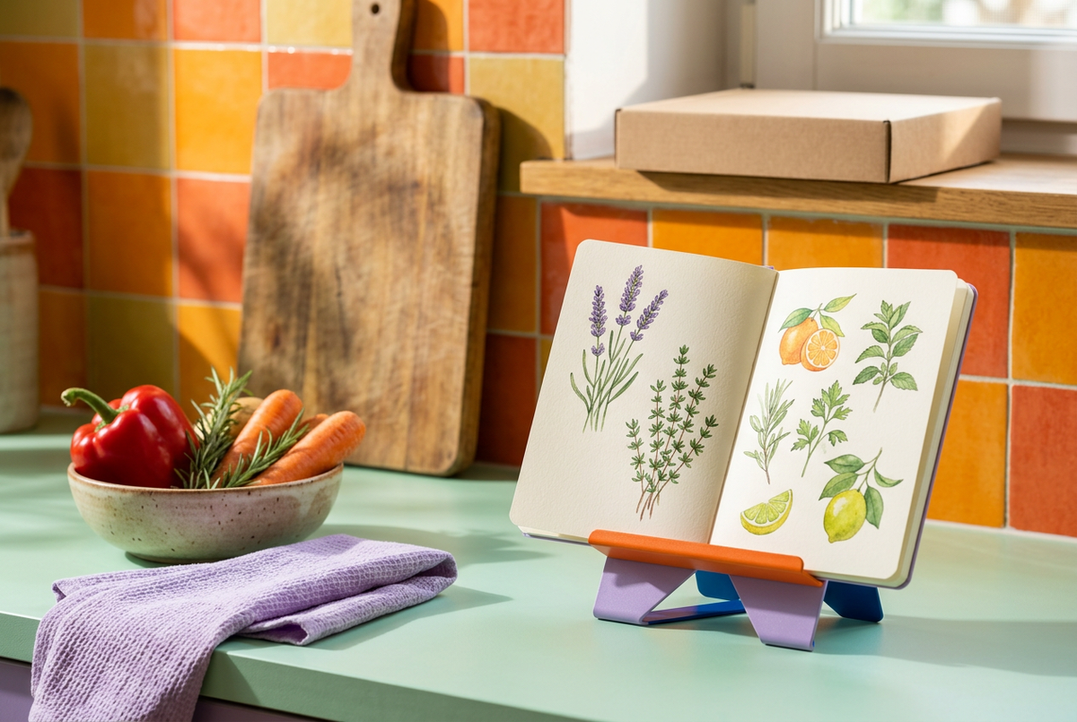
Pagebright Color-Block Kitchen Cookbook Stand with Lavender Slotted Panel, Tangerine Book Ledge & Cobalt Support
Pagebright Color-Block Kitchen Cookbook Stand with Lavender Slotted Panel, Tangerine Book Ledge & Cobalt Support
Couldn't load pickup availability

📖 The Recipe Deserves a Place at the Table
Some meals begin with a familiar page. A penciled note beside an ingredient, an illustration that reminds you of summer, or a recipe you have been meaning to try for weeks. Pagebright gives that page a deliberate place in your kitchen: tilted toward you, resting on a contrasting front ledge, and framed by a playful combination of lavender, tangerine and cobalt.
This is not another container for things you need to put away. It is a stand for something you want to keep in view. With its broad panel, two elongated openings and distinctive split-foot silhouette, Pagebright brings a graphic, almost architectural presence to the counter. Even when the book is closed and dinner is finished, its color-block form remains part of the room.
First, a Different Way to Set the Scene
Before the chopping board comes out, choose your recipe and give it its own position. Place the stand on a level, dry section of countertop, away from the sink and cooking heat. Set a suitably sized book against the lavender panel, with its lower edge resting on the orange ledge. Keep your preparation space beside it rather than underneath it.
That small separation creates two distinct zones: one for looking, one for doing. The stand does not need to be the center of the kitchen. It only needs a clear spot where you can glance at the next step, turn a page when necessary, and return to the ingredients in front of you.
🔎 A Closer Look at the Shape
The panel: A broad lavender face provides the main visual plane. Its rounded upper corners soften the rectangular outline, while two long oval openings introduce a pair of vertical lines. When the stand is empty, those openings allow the background color to become part of the design.
The ledge: A tangerine-orange strip crosses the lower front, creating a contrasting resting place for the bottom edge of a suitable book. The raised lip is visibly distinct from the panel, so the point of support is easy to identify. Its warm color also gives the stand a strong horizontal accent.
The rear support: A cobalt-blue support sits behind the angled face. Seen from the side, the front and rear elements form an open triangular profile rather than a solid block. The blue becomes especially noticeable from a three-quarter angle, adding a third color without covering the front surface.
The lower outline: A triangular opening separates the two front feet. This detail repeats the angular language of the side profile and keeps the silhouette recognizable beneath an open book. The combination of curved slots and sharp lower geometry gives the design its particular character.
🍋 One Stand, Three Chapters of Kitchen Life
Chapter One: The Weeknight Experiment
You have chosen a dish outside the usual rotation. Position a recipe book on the stand before you begin, then read through the whole method once. Keep a clear space for the ingredients and leave enough room behind the stand for its rear support. As you work, the recipe has a designated location instead of sharing the chopping area.
Chapter Two: The Weekend Bake
A recipe notebook, a clear counter and a little time can make a baking session feel like an occasion. Use Pagebright for a suitably sized notebook, with the orange ledge supporting its bottom edge. Turn pages with clean, dry hands and reposition the notebook if its binding pulls it closed. There are no page clamps shown in the design, so a tightly bound book may still need occasional attention.
Chapter Three: The Quiet In-Between
When you are not following instructions, use the stand to display a favorite illustrated cooking book or an open spread that suits the season. A botanical drawing, a handwritten menu or a food illustration can give the counter a personal point of interest. Choose something the panel and ledge can comfortably support rather than forcing an oversized volume into place.
Design Notes: Why These Colors Work Together
Lavender sets a calm foundation without disappearing into the background. Tangerine adds a concentrated band of warmth at the front. Cobalt introduces a deeper note behind the panel, making the side view feel as considered as the front. The three colors occupy separate structural elements, so their contrast follows the form rather than appearing as a decorative pattern.
Against a mint or cream counter, the palette feels fresh and playful. Against natural wood tones, the orange connects with the warmth of the surface while lavender creates contrast. In a room with stronger colors, repeat just one shade nearby instead of matching everything. A purple towel or an orange bowl is enough to create a visual connection.
📝 Your Before-You-Cook Checklist
- Choose a level, dry surface with enough depth for both the front feet and rear support.
- Keep the stand away from burners, open flames, steam and splashing water.
- Place the book centrally, with its lower edge seated on the orange ledge.
- Check that the book rests comfortably against the panel before letting go.
- Leave space for page turning and avoid placing the stand at the edge of the counter.
- If a book is too large, heavy or tightly bound to rest securely, use a smaller recipe notebook instead.
This design is a recipe-viewing accessory, not a cutting surface, a pan support or a splash shield. A little care with placement makes the arrangement more practical and keeps your reference material away from the busiest part of preparation.
For the Cook Who Notices the Details
Pagebright suits a kitchen where everyday tools are allowed to be expressive. The cook who chooses a favorite mixing bowl for its color, keeps handwritten recipes, or enjoys laying out ingredients before starting will recognize the appeal: a useful object with a clear visual identity.
It also offers a different kind of countertop accent. Instead of hiding the cooking process, it makes the reference page part of the scene. The empty stand shows its slots and color blocks; the occupied stand frames a book and lets its orange ledge and lavender feet remain visible. Those two appearances give it a role both during preparation and between meals.
What You Are Looking At
The product concept shown is one color-block cookbook stand with a lavender front panel, tangerine book ledge and cobalt rear support. The packaging design is a plain kraft-brown rectangular box without a printed logo. Books, notebooks, bowls, vegetables, chopping boards and textiles in the photographs are scene accessories, not included components.
The pictured configuration presents a single inclined viewing position. It is not offered here as an adjustable-angle mechanism or a universal holder for every book size. Exact dimensions, material specifications and supported loads should be checked against the supplied physical product before purchase.
💜 Keep the Page. Enjoy the Process.
A good recipe can lead you somewhere new, but the experience is made of ordinary moments: checking an ingredient, finding the next instruction, pausing before the final step. Pagebright gives those moments a colorful setting. Set out your reference, clear a place to work, and let the next meal begin with a page you are excited to follow.